Fable Anniversary’s new user interface detailed
Original user interface completely redone for upcoming remake.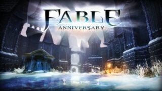
Fable Anniversary, Lionhead Studios’ February-due remake of Fable, will have a revamped user interface compared to the original game.
User interface artist Jenny Peers detailed the new interface over at Lionhead’s official blog. Find the information below.
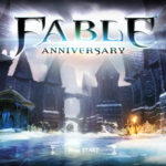
Press Start
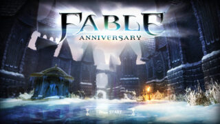
One of the first screens players are greeted with in Fable Anniversary is the Press Start screen. I have made 4 versions of this screen which are randomly displayed each time you load the game. The key thing I wanted to do with these screens was to make them interesting and showcase a range of different environments you can explore in the world of Albion.
Frontend and Pause Menu
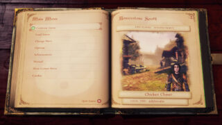
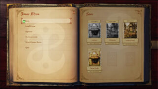
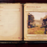
Once you have pressed start, you are taken to the frontend menu which takes the shape of a book. While designing what the frontend should look like with lead designer Ted Timmins, we went through a number of different layouts and ideas. When we sat down to review all the concepts we noticed there were a few things that were still not quite working. Ted randomly commented “Can it be a book?” and the more we thought about it, the more it made sense. Each player is starting their own story as a new hero, as they progress through the game every action is being documented and their own story book is made.
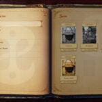
I created a new set of concept images and worked on the visual design of this Fable book. This has also inspired the design of our strategy guide. The book theme is used for both the frontend and the pause menu, and strengthens the paper theme which runs through the Inventory as well as other HUD features. It makes use of simple navigation to enable the player to quickly start or continue a game, manage their saves (all 18 of them!), and make a new hero as well as featuring a special achievements page! (There will be more information on the achievements soon!)
HUD
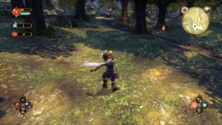
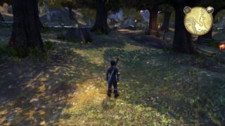
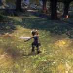
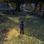
Being the UI element that’s viewed most, the first task I gave myself was to tackle the HUD. I wanted to design something that remained familiar to players who have played the original game while still creating a fresh and refined UI. The visual treatment I decided on uses golden framed elements to help celebrate Fable Anniversary and give a bit of elegance. The HUD uses over 400 unique icons for displaying objects including items, characters and spells. I recreated all icons as vector shapes which has allowed them to be resized quickly and easily for multiple uses. The Mini Maps have been restyled to have a more hand drawn look and the map container can be easily resized or completely hidden for the more advanced player. As you play the game, elements of the HUD fade in and out as and when they are needed, minimising the amount of information on screen at any one time. Players also have complete control over the HUD opacity. If you want to raise the difficulty of your game, try setting it to 0%!!!
Inventory
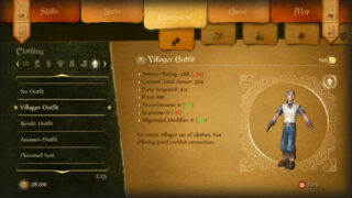
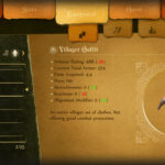
The inventory screen was one of the biggest changes to the UI. The original game had many levels of options which you had to go back and forth through to find what you were after. I have tried to simplify it by creating a new layout which allows for quicker navigation. The Xbox 360 Controllers trigger and bumper buttons control which section you are viewing and their sub-sections.
The two thumb sticks and D-pad are put in control of filtering the content and reading item descriptions. Using this new layout players can quickly flick from choosing their equipment to reading about their current quest with minimal button presses.
Quest Complete
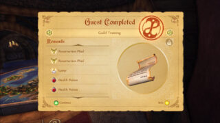
The Quest Start and Quest Completed screen follows the paper visual style by presenting you with an actual quest card. The card presents a summary for the active quest on its front side, it can then be flipped to show a more in-depth breakdown on its reverse side. When you have completed a quest successfully, all rewards gained are listed and the card is given a Guild stamp of approval!
Region and World Map
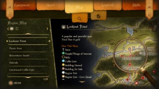
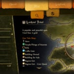
The Region Map screen now has more space to show the map and text for each location, making it easier to see region information at a glance such as which shops a town has or if any houses are for sale. Players can also filter the location list so only regions that have active quests are displayed. The world map itself has had a big visual style update (secret password “52 chickens”) so it looks more hand drawn and compliments the updated mini maps. I referred to the original Albion map heavily and was keen to try and keep a familiarity between the old and new. By keeping the colours similar I hope that, at a glance, players still recognise it as the iconic Albion map. A new full screen world map view has been added, allowing players to zoom in and pan around to explore every fine detail as well as utilising it for loading screens. It was important to me that the map should become more of a feature, animations and a few hidden surprises have been added for the keen eyed adventurer…
View screenshots of the new UI at the gallery.
