Dear Sony, This Is Your In-Game XMB Inspiration

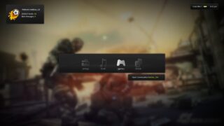
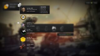
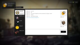
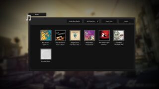
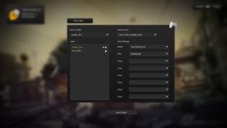
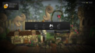
A very talented member of the Official PlayStation.com Forums, “mattious_28”, has come up with what he believes the in-game XMB should really look like as he describes the current fit as “dull and to be honest, boring.”
It’s an incredibly well design that Sony should consider getting inspired off of. “mattious_28” designed a better layout, in my opinion, than the NXE’s in-game dashboard (which is awesome, so this must be good).
Hit the jump for the amazing in-game XMB design from “mattious_28” in images.

