What’s the difference between Kid Icarus: Uprising’s U.S. and Japanese box arts?
There are two disparities.
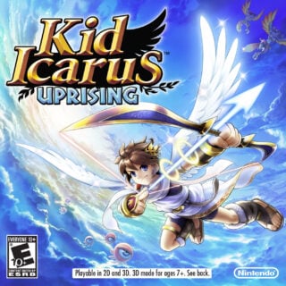
I’ll let game director Masahiro Sakurai take this one.
He tweeted today: “The package artwork for [Kid Icarus: Uprising] in Japan and overseas are the same, but there is a difference somewhere.”
Can you spot the difference?
From our sponsors


LOL! I guess Pit is happier in the japanese release :P
It’s kind of weird when you think about it.
Were these subtle changes really necessary? Why does the background on the U.S. release have to be less ambient? Why can’t Pit be happy?!
@Sal Romano:
Perhaps it’s their understanding that American gamers would look up to a serious, fierce hero rather than a cheery, happy one?
It’s weird but in fact the US covers usually differ greatly from the japanese ones. Europe usually gets covers similar to those from Japan.
I really dont see how the change was necessary. In fact it makes little sense at all. For the record, the differences I can spot are that on the US boxart pit is not smiling, a splash of background colour is different and the ‘eye monsters’ appear closer. Hmm, very strange.
You guys missed the obvious.
The title is in Japanese!
Thank you, thank you. I’ll be here all week.
@wccrawford: My God.
@wccrawford: Literally the FIRST thing I noticed. You and I are geniuses.
Does the japanese version not have the rating and Nintendo logo at the bottom? If that is exactly how it is for the Japanese version than its nicer not having all that crap at the bottom getting in the way of the art.
@Keegs79:
Nah, it has all the information and logos on the cover as well.
Here’s a tiny, tiny pic of the game’s packaging, japanese release:
>:/
>:D